

FACEBOOK GOES BACK TO BASICS WITH LATEST NEWS FEED
REDESIGN BUT THE QUESTION IS HOW MANY USERS LIKES THE NEW DESIGN?
Almost exactly one year ago, Facebook laid out its vision for the future of News Feed. Facebook spent months refining its new design, which touted huge photos, a dynamic navigation bar, and Tumblr-esque profile photos. The company rolled out its new design to a fraction of its billion users, and then called the whole thing off. Users hated the new design. So for its next News Feed, Facebook went back to square one.
Today the social network is unveiling its latest design for News Feed, which takes learnings from its failed trial and applies them to a familiar but fresh design that it plans to roll out globally over the next few weeks. The new News Feed looks almost exactly like Facebook's mobile News Feed, bearing new iconography, bigger photos, new fonts (Helvetica and Arial), and story cards. The design ditches the prominent drop-down menu of feeds Facebook championed in its designs last March, and sticks them back in the left sidebar. In other words, Facebook's dreams about turning your News Feed into a newspaper of RSS-like feeds are officially over. News feeds like "All Friends," "Groups," and "Photos" have been removed entirely.
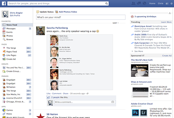
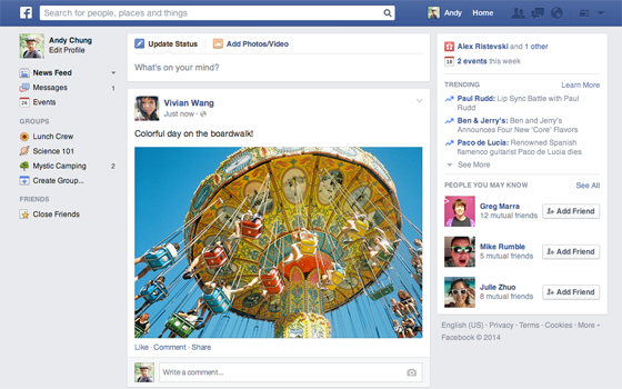
A comparison of Facebook's old (above) and new (below) News Feeds reveals the move to a cleaner look.
"People don't like us moving their furniture around, because you break muscle memory," says News Feed product manager Greg Marra. Facebook's dark-themed sidebar, which collapsed into a strip of icons depending on your screen size, was just too confusing for most users, he says. "That's a particular design idea that looked cool but didn't help you get around the site," Marra says. "You don't need to relearn anything that was one of our big themes." Facebook has also redesigned and simplified what were previously considered complex post types. If a friend commented on a post about a link that two friends shared, indentations while accurate in terms of attribution — made things look really messy, Marra says. Profile photos have also notably been moved back inside story cards, like in the old News Feed, to limit clutter.
please comment of what you think of the new design.
I like the new design. It looks fresh and cleaner. I like how different posts are divided.
ReplyDelete